Programming for Web Mapping Portfolio
Web Cartography at the University of Kentucky
Created by John Davis: Mapping Enthusiast and Sojourner of Continents
This portfolio demonstrates mapping projects created using
various tools, applications, and software programs used in
University of Kentucky's New Maps Plus Program.
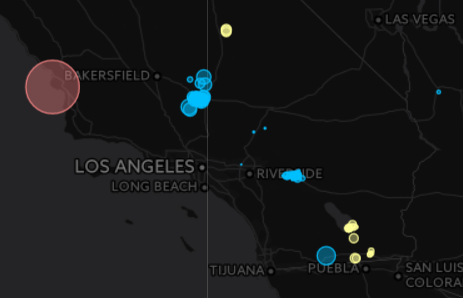
This map was created using data from The Organ Procurement and Transplantation Network (OPTN). This web map shows the number of organ donors and transplants across the U.S. from 1991 through 2016. Proportional symbols for the number of transplants and donors for each state are shown with additional interactive elements and information in order to learn more about each state's growing awareness of the help organ donors are for patients requiring life saving organ transplants.
- Explore more of the national data available from my data sources through
- The Organ Procurement and Transplantation Network OPTN and
- The United Network for Organ Sharing (UNOS)
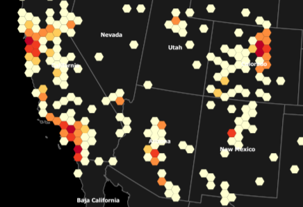
This map was created using point data from The POI Factory. The hexagons displayed represent a spatial distribution of those locations known as hexbins, which group points into a grid of hexagons. These points are grouped in each hexagon by using point in polygon analysis within QGIS. The data is classified into equal groups to show the distribution and density across the nation, where the lighter colored hexagons have a less breweries within a 50km distance, while the darker red hexagons have more breweries. An inset map displays a highly concentrated area of breweries around Boulder, CO with stars showing their point distribution within the hexagons.
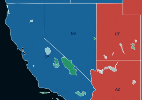
This map shows all 59 US National Park boundaries as proportional symbols based on how many acres in each park per visitor in 2015. I used Carto's Bubble effect to create graduated symbols based on acres per person. If every visitor had their own private space in each park, how many acres would they enjoy all to themselves and which park would grant you the most and least amount of space? I calculated acres per park divided by number of visitors to create proportional symbols for the parks and when zoomed in, the park boundaries are shown with graduated colors to indicate the most amount of space in each park per person to enjoy the most acres of peace and quiet.
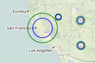
This interactive web map shows Geothermal, Wind, and Solar power plants across the US and was created using Javascript code utilizing the Leaflet Javascript Library API to customize Leaflet methods and events to produce a dynamic map. A custom function was created to calculate a radius of each circle marker based on the capacity of each power plant's fuel source, either Geothermal, Wind, or Solar. By clicking on the map, power plants wthin a 500km radius of your cursor are shown. Clicking on each facility's proportional symbol renders an informative window for each facility.